Dave Masala
Over 8 decades of wisdom simplified to a formula
Expertise included
Research
Strategy
Packaging
Identity
Packaging Design
Range Architecture
The Challenge
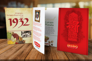
Dave Masalawala from Indore; with their flagship brand ‘Dave Ka Divya’ (DkD) are known to have the strongest mind share and recall in Madhya Pradesh, Chhattisgarh and Eastern Maharashtra in the spice category. Incepted in year 1932, the brand owners are leveraging the legacy and establishment of the brand effectively in the heartland. Hence visioning to explore new markets going ahead.
‘Dave Ka Divya’, being quit a tongue twisting Hindi name was a challenge seeing the brand expansion in changing consumer base (and export markets in future). The challenge therefore was to create a new brand with a preposition that takes care of large platform in a cluttered category. Before engaging with TNP the brand owners have registered the numerals ‘444’ as the name for new brand. Having aware about the fact that product will continue to remain in traditional format; its packaging, appearance at point of sale had relatively weak scope to cut through.
The Solution
Firstly, TNP gave the brand a relatable, elastic thought that made its numeric brand name easy to decode and interpret. Conveyed ‘444’ as a ‘formula’ for various daily desires that the consumer may consider the brand to fulfil; such as ‘Khushiyon ka formula’, ‘Dil jeetne ka formula’, ‘Taazgi ka formula’ and so on.
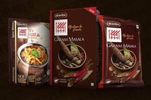
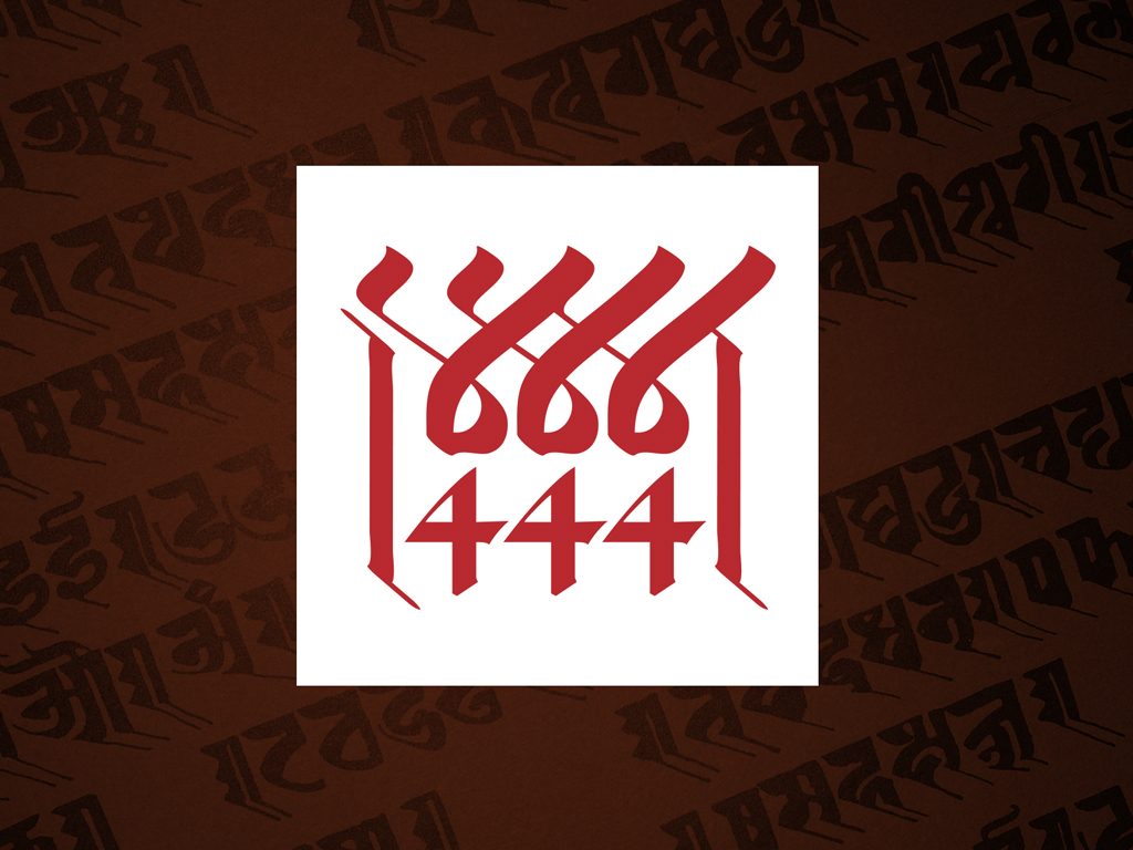
To create the visual identity of the brand, team TNP arrived at a strategy to leverage the rootedness and the legacy DkD. The brand therefore was shaped as a sub-brand. This allowed appropriate endorsement and year of expertise to be the part of it effortlessly. A multilingual brand mark crafted using the traditional style of Devnagari and Roman calligraphy in a clean, contemporary feel.
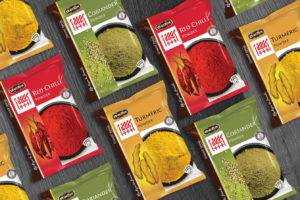
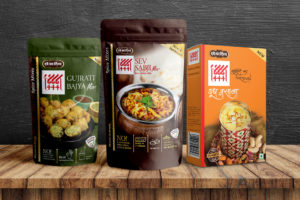
And finally to cut through the clutter and norms followed by the category players, suggested a house colour Deep Brown to enable 444 have magnitude on shelves. Further to that the mechanism of 25% flexibility of visual indicators efficiently helped consumers & retailers to identify each sub-range and variant packs at the PoS.
Let's Talk...
The Neon Project
701, Stellar Tower,
V. N. Purav Marg, Diamond Garden,
Chembur East,
Mumbai 400071
