Hindustan Unilever Limited
Imprinting Comfort baby steps in Indian Market
Expertise included
Research
Strategy
Identity
Typography
Packaging Design
Retail Design
Brand Communication
The Challenge
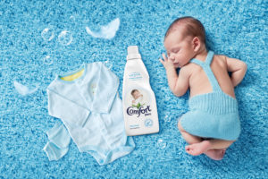
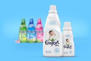
Comfort Pure, a brand loved by mommies around the world wanted to imprint its baby steps in Indian market. Comfort Pure has been much appreciated and adored for the extra softness it offers for baby cloths caring for their delicate skin. The task was to help the brand extend its global footprint in Indian market by devising a pack that the moms here could choose to fulfill their desire to cocoon babies with paramount love and comfort.
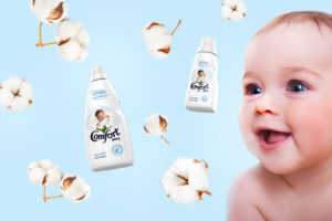
Being a new member in Comforts’ India portfolio, it was important firstly to let it belong to the world of baby products. Subsequently to reinforce the key benefit from baby skin standpoint.

The Solution
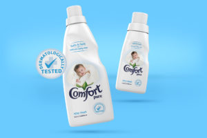
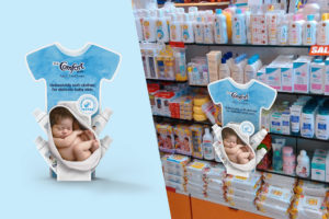
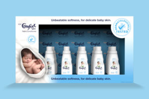
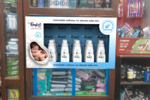
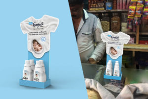
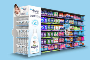
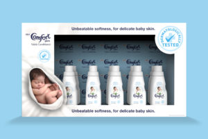
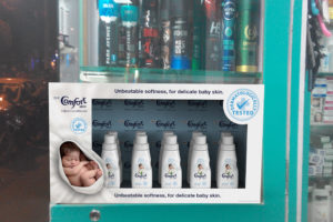
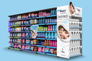
Our design solution added touch of hygiene & care with pristine White in brand visual appearance. Added a careful endorsement by dermatologist to take care of the safety credentials on pack front. Design intervention extended to help ‘Comfort’ step in modern trade (MT) as well as general trade (GT) outlets effectively.
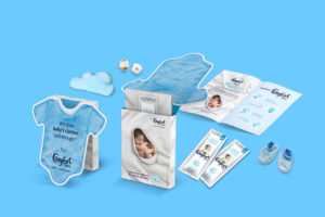
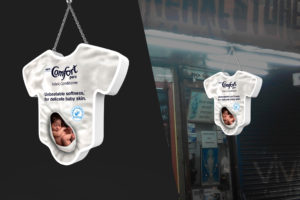
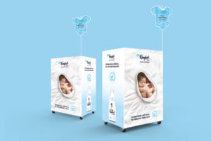
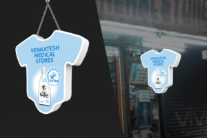
Through various collaterals and point of sale merchandise, we devised precise communication targeting sales staff and shopper explaining the critical skin difference between an adult and a baby, and mildness of Comfort Pure. Effective use and control of colour blocking (White + Baby Blue) made the solutions deliver effectively at MT & GT premise. Brand visibility and voice, both came together to speak with its audience.
Let's Talk...
The Neon Project
701, Stellar Tower,
V. N. Purav Marg, Diamond Garden,
Chembur East,
Mumbai 400071

