Hindustan Unilever Limited

Pushing the deserving difference at the Point of sale

Expertise included 
Research
Strategy
Retail Strategic Design
Experience Design

The Challenge

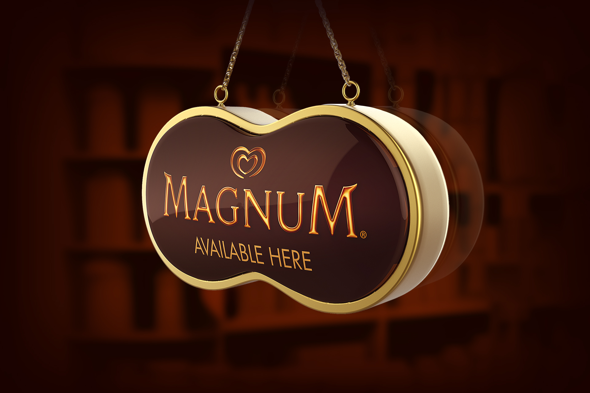
For a pan-India launch, Magnum needed to improve its visibility and enhance its brand image at the point of sale. In a chaotic marketplace, we bolstered ‘Made with Belgian Chocolate’ which broke the clutter to get Magnum effectively speak the inherent differentiator it had and enhance its brand image. Powerful key visual with a strong drool factor convincingly justified the price difference; modified colour blocking helped create a distinct identity. Crafting a stand-out brand promise. 
 
With presence in more than 40 countries, Magnum is one of the most loved ice cream brands across the globe. It is a top of the line premium Ice Cream brand with quite a few competitors in India, including branded retail chains, stand alone parlor chains, un-organized ice cream manufacturers and retailers. Launched first in tier-1 cities of India, Magnum is now widely available in most of the MT’s & GT’s. Available in 5 flavors, Magnum has always focused on the royal treatment.
 
 In a pan India launch for Magnum, we were tasked with a challenge to boost visibility through distinctive communication and enhanced brand image at the point of sale. Using ‘dark’ brand colours to create striking imagery in both well-lit and dim environments, we had to shape a design that fits in well in traditional as well as modern trade without losing brand stature and essence.
1920 hul mgnm sign

The Solution

Site visits and meet-ups clearly pointed to the missing link – a lack of emphasis on the USP in the communication at the Point of sale. Very few shoppers were aware of Magnum’s genuine promise. Thus leading to a comparison based solely on price point with the brand available next door. We proposed the clutter breaker ‘Made with Belgian chocolate’ with an added emphasis in the total brand mix. Also identified the potential winning points to frame a more promising brand story.
 
 The USP was visually presented with the appropriate drool and drew attention; distinguishing the brand and justifying the price. Use of brand colours with modulated colour blocking made the elements stand out everywhere. The elasticity of concept along with modularity & detailing of designs made them work across a multitude of retail scenarios, distinguishing Magnum from the lower priced players.

Let's Talk...

Google Pin icon 01

The Neon Project
701, Stellar Tower,
V. N. Purav Marg, Diamond Garden,
Chembur East,
Mumbai 400071